Design System · Case Study
Nvoye Design System
Reduced handoff and code review time by 30% by building a 1000+ component design system with strict tokenization and 1:1 Figma-to-code handoff for an embassy-facing product.
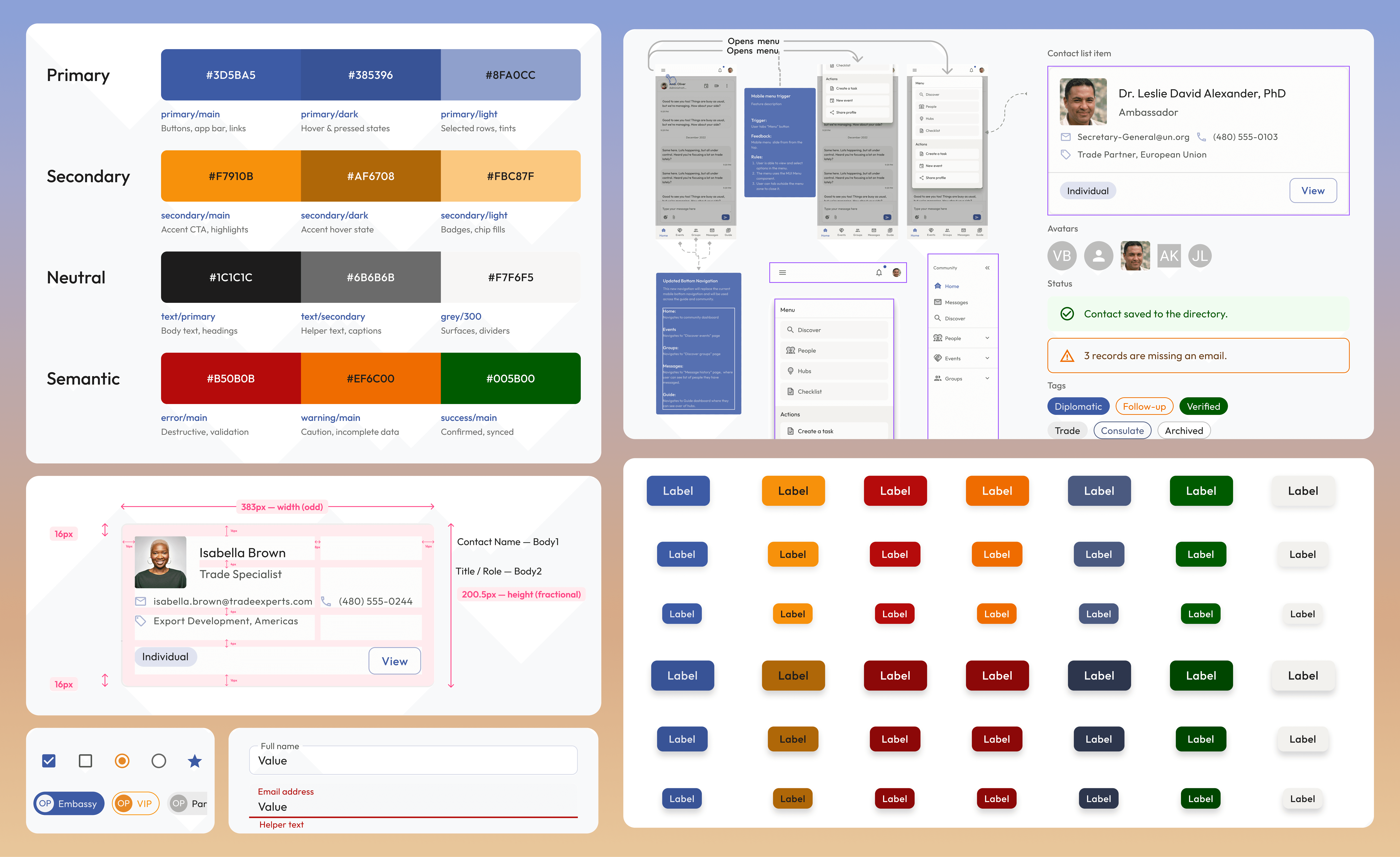
9
Component families
1,135
Documented variants
4
Responsive breakpoints
1
Source of truth, Figma / React parity


Decision 05 · Accessibility
Three accessibility calls made at the token layer
01
The error ramp was overridden
Material's default error #d32f2f sits at roughly 4:1 on warm paper, so it fails small text.
02
Status colours ship as pairs
Every severity carries a background and a foreground token together .
03
Focus is a first-class state
Button, Chip, Select and Text Field each enumerate Focused alongside Hovered, drawn from the shared focusVisible token at 30%.


Foundations · Layout
A base-8 px grid system for horizontal and vertical spacing
Spacing
Much like a seasoned architect who meticulously plans and arranges building blocks to construct a well-designed structure, I believe a design system's foundation is anchored in its spacing and grid.

Decision 06
Responsiveness as a property
<Container> carries Max width (Desktop / Laptop / Tablet / Mobile) and a Disable Gutter boolean. Choosing a breakpoint is a picker selection, not a note in the margin, and it maps exactly onto the MUI Container props the engineers already use. A rule in a redline gets skipped; a rule in the variant picker gets used.
Max width
Desktop 1440 · Laptop 1024 · Tablet 640 · Mobile 375
Disable Gutter
boolean, removes the side padding
Nesting
supported, but almost never needed
Breakpoints
Breakpoints are stored as variables, not as frame names. That is what makes the next decision possible: the layout rule can be bound to a component property instead of written into a redline.

The same screen composed at mobile, tablet and laptop widths from one Container.
“The container centers your content horizontally. It's the most basic layout element.”
Shipped with the component.
Component architecture
Component library for engineering handoff
Decision 07
Detailed buton component with 400+ variants
A designer who needs size=small, color=error, variant=outlined, state=disabled finds it on the canvas instead of mocking it up. QA gets a reference image. Engineers never meet a combination that was never specified. The cost is scale (Chip alone is 448 variants) and that is only acceptable because the matrix is generated off one base component rather than drawn by hand.
405
Button variants · 3 variants × 3 sizes × 9 colours × 5 states
5
States enumerated: enabled, hovered, focused, disabled, loading
0
Undocumented combinations in the shipped families
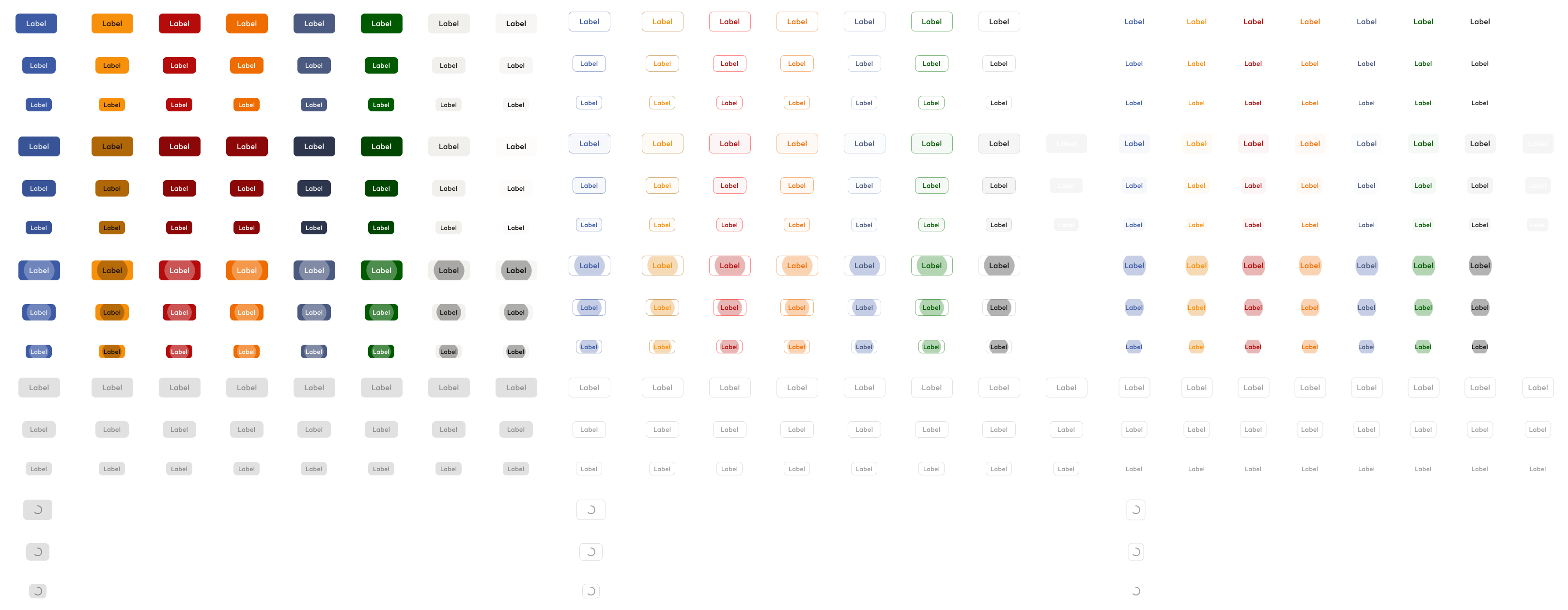
The Button property table: axes on the rows and columns, every cell a real variant.
Decision 08
Documentation on the same canvas as the component
Each family is laid out identically: a heading rail stating category, name and purpose; a property panel naming every prop; and a property table whose rows and columns are the variant axes. There is no separate wiki to fall out of date, because the reference is the artefact.
Heading rail
Category, component name, one-line purpose, link to the MUI docs: the same four facts in the same place for all nine families.
Property panel
Every property spelled out with the name a developer will type, including the ones that are booleans rather than variants.
Property table
Axes on rows and columns, every intersection filled. Reading across a row is reading a state machine.

Alert: heading rail, property panel and severity × variant table, read left to right.
Contact Management Design System · a customised MUI v5 theme for Nvoye. Thank you for reading.